
How did a pizza break create gaming's most iconic character? Discover the revolutionary design decisions behind Pac-Man and the timeless lessons every designer should know.
Sometimes the best ideas emerge from the simplest moments. A coffee break. A casual conversation. A slice of pizza.
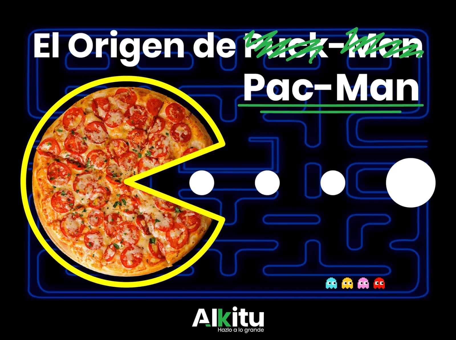
In 1979, one pizza break changed video game history forever and created what would become the most recognizable character in gaming. This is the story of Pac-Man—and the revolutionary design principles that made this simple yellow circle an immortal icon.
In this comprehensive guide, you'll discover the fascinating origin story behind Pac-Man's creation, understand the strategic design decisions that made the character universally appealing, and learn proven design lessons you can apply to your own logos, mascots, and brand identities today.
Whether you're a designer, entrepreneur, or simply curious about what makes iconic designs tick, the story of Pac-Man offers invaluable insights into audience-focused design, cultural adaptation, and the power of simplicity.
The Pizza That Changed Gaming History
It was 1979 in Japan. Toru Iwatani, a young game designer at Namco, was working late with his team on a challenging project. During a much-needed break, they ordered pizza—a decision that would inadvertently launch a cultural phenomenon.
As Iwatani reached for a slice, he looked down at the remaining pizza. With one wedge missing, the pizza formed a distinctive shape—a circle with a triangular mouth. In that instant, the concept for Pac-Man was born.
"I wanted to create a character that was simple, cute, and appealing to everyone—not just hardcore gamers." — Toru Iwatani
Why This Moment Was Revolutionary
This wasn't just luck. Iwatani's mind was primed to see possibilities because he was actively searching for a new approach to game design. While other designers were creating increasingly complex characters for space shooters and combat games, Iwatani was looking for something fundamentally different.
The pizza moment represents a crucial design principle: breakthrough ideas often come when you're solving a specific problem. Iwatani wasn't randomly doodling—he was actively seeking a character design that would achieve specific business objectives.
Key insight: Great design often emerges from constraint. Iwatani needed something simple, friendly, and universal. The pizza provided all three.
The Target Audience Challenge
Here's where the story gets strategically fascinating. Namco didn't ask Iwatani to create "any game"—they gave him a specific challenge that would shape every design decision.
The 1979 Arcade Problem
In the late 1970s, arcades were dominated by violent, combat-oriented games:
- Space Invaders (1978) - Shooting alien invaders
- Asteroids (1979) - Destroying space rocks
- Galaxian (1979) - Battling alien spacecraft
These games shared common characteristics:
- Combat-based gameplay
- Dark, space-themed visuals
- Aggressive sound effects
- Almost exclusively male players
Namco saw an untapped market. Half the population—women—weren't playing arcade games. Not because women weren't interested in gaming, but because the available games weren't designed with them in mind.
The Strategic Design Brief
Iwatani's team received a revolutionary brief: create a game that would attract female players to arcades. This wasn't just about inclusivity—it was smart business strategy that would expand the entire market.
This constraint fundamentally shaped every design decision:
- No weapons - Violence was seen as male-oriented
- Cute aesthetics - Approachable rather than intimidating
- Simple mechanics - Easy to learn, hard to master
- Food-based theme - Universal appeal across cultures
Design lesson: Understanding your target audience isn't just about demographics. It's about identifying unmet needs and designing specifically to address them.
Design Philosophy: Cute Over Combat
With the target audience defined, Iwatani developed a design philosophy that would guide every creative decision. His insight was beautifully simple:
"Eating doesn't involve killing anyone. Perhaps women would enjoy a game based on eating." — Toru Iwatani
The Non-Violence Innovation
This single statement revolutionized game design. Instead of destroying enemies, players would eat dots. Instead of aggressive action, the core mechanic was consumption and collection.
The philosophy extended to every element:
Character Design:
- Round, soft shapes (no sharp edges)
- Bright yellow color (warmth, happiness)
- A mouth as the only feature (friendly, non-threatening)
- No arms or weapons (peaceful intent)
Gameplay Elements:
- Dots to eat (satisfying collection mechanic)
- Fruit bonuses (familiar, pleasant imagery)
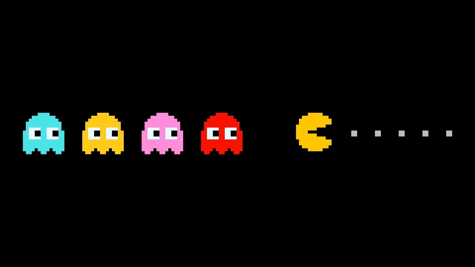
- Ghost enemies with personalities (cute, not scary)
- Power pellets that flip the dynamic (empowerment without violence)
Audio Design:
- "Waka waka" eating sound (playful, memorable)
- Upbeat music (energetic but not aggressive)
- No explosion sounds (peaceful atmosphere)
The Psychology of "Cute"
Iwatani understood something profound about human psychology: cute designs create emotional connection. When players saw Pac-Man, they didn't feel intimidated—they felt affection.
This "cute factor" (known as "kawaii" in Japanese culture) would become a defining characteristic of Japanese game design, influencing everything from Pokemon to Mario to Hello Kitty.
Design principle: Emotional connection trumps technical complexity. A simple character people love beats a complex character people forget.
From Puck-Man to Pac-Man: A Branding Lesson
The character we know as Pac-Man wasn't always called that. The original Japanese name tells an interesting story about design inspiration and cultural adaptation.
The Original Name: Puck-Man
In Japan, the character was named Puck-Man (パックマン). The inspiration was surprisingly literal:
- The character's shape resembled a hockey puck (a flat disc)
- The Japanese onomatopoeia "paku-paku" describes the sound of chomping or eating
- "Puck" captured both the physical shape and the eating action
The name worked perfectly in Japan. But when Namco prepared to launch in American arcades, they discovered a serious problem.
The Localization Challenge
American arcade machines were often placed in unsupervised locations—convenience stores, laundromats, bowling alleys. Namco's American distributors realized that "Puck-Man" could easily be vandalized to create an offensive English word by changing one letter.
Imagine arcade machines across America displaying a crude modification of the name. The family-friendly game targeting women and children would instantly become inappropriate.
The Strategic Name Change
The solution was elegant: change "Puck" to "Pac." This simple modification:
- Preserved the connection to "paku-paku" eating sound
- Eliminated the vandalism vulnerability
- Created a distinctive, memorable name
- Allowed the brand to maintain its family-friendly image
Branding lesson: Great names work across cultures and contexts. Always consider how your brand name might be perceived, modified, or misused in different markets.
Character Design Elements That Made History
Let's analyze exactly what makes Pac-Man's design so effective. Understanding these elements will help you apply similar principles to your own design work.
The Power of Geometric Simplicity
Pac-Man is essentially three shapes:
- A circle (the body)
- A triangle (the mouth cutout)
- A dot (the eye)
This extreme simplicity offers enormous advantages:
- Instant recognition - No details to process
- Perfect scalability - Works at any size
- Universal appeal - No cultural or age barriers
- Easy reproduction - Consistent across all media
- Memorable silhouette - Recognizable even as a shadow
Compare this to the complex character designs of 1979 arcade games—spaceships with intricate details, alien creatures with multiple elements. Pac-Man proved that less really is more.
The Psychology of Yellow
Color choice in character design is never arbitrary. Yellow was selected for specific psychological reasons:
Positive Associations:
- Happiness and optimism
- Energy and playfulness
- Warmth and friendliness
- Visibility and attention
Practical Benefits:
- High contrast against dark maze backgrounds
- Eye-catching in crowded arcades
- Memorable and distinctive
- Photographed well for marketing
Cultural Neutrality:
- Yellow has positive meanings across most cultures
- Unlike red (danger in West, luck in China) or white (purity in West, death in East), yellow's associations are consistently positive
The Mouth as Identity
The single most distinctive element of Pac-Man is the mouth—a simple triangular cutout that transforms a circle into a character.
This design choice embodies the game's core mechanic. The character is eating. The design shows eating. Form follows function in the most elegant way possible.
The mouth also provides:
- Animation potential - Opening and closing creates life
- Direction indication - Players always know which way Pac-Man faces
- Emotional expression - The "chomp" feels satisfying
- Brand recognition - The shape is instantly identifiable
Ms. Pac-Man: Breaking Barriers
The success of Pac-Man created an unprecedented opportunity. In 1981, Ms. Pac-Man became the first female protagonist in video game history—a milestone that deserves recognition.
The Origin Story
Ms. Pac-Man wasn't created by Namco. A group of MIT students at General Computer Corporation had created an unauthorized Pac-Man modification called "Crazy Otto." Rather than sue, Namco saw the potential and licensed the concept, transforming Crazy Otto into Ms. Pac-Man.
Design Differentiation
The design team faced a challenge: how do you indicate "female" in a character that's essentially a circle with a mouth?
Their solution was elegant and used visual shorthand that audiences would immediately understand:
- A red bow - The most recognizable feminine accessory
- A beauty mark - A classic symbol of glamour
- A winking eye - Adding personality and flirtation
- Lipstick - Subtle color addition to the mouth area
Design insight: When working with extremely simple shapes, small additions carry enormous meaning. The bow alone transforms perception completely.
Cultural Impact
Ms. Pac-Man proved several important points:
- Female protagonists could succeed - The game outsold the original in America
- Simple design changes work - Minor modifications created a distinct character
- Market expansion is real - The "targeting women" strategy succeeded
- Characters can become icons - Ms. Pac-Man remains beloved 40+ years later
Design Evolution Over Decades
One of the most fascinating aspects of Pac-Man's design is how it has evolved while maintaining core brand recognition. This balance between evolution and consistency offers crucial lessons for brand management.
The Original Era (1980-1985)
The original Pac-Man was purely two-dimensional:
- Perfect circle shape
- Flat yellow color
- Simple pie-slice mouth
- Single pixel eye
This design was dictated by technical limitations—early arcade machines couldn't render complex graphics. But these constraints created the character's distinctive simplicity.
The 3D Transition (1990s-2000s)
As gaming technology advanced, Pac-Man gained new dimensions:
- Spherical body with depth
- Arms and legs for mobility
- Gloves and shoes for personality
- More expressive facial features
- Maintained yellow coloring and mouth shape
The key insight: the essential elements were preserved. Even with arms and legs added, Pac-Man was still recognizable because the yellow circle with chomping mouth remained.
Modern Era (2010s-Present)
Today's Pac-Man appears across countless media:

- Video games - From mobile apps to VR experiences
- Movies - The "Pixels" film featured a 3D Pac-Man
- Merchandise - Clothing, toys, home goods
- Collaborations - Fashion brands, other games, advertising
Through all these variations, core design elements remain constant:
- Yellow color
- Circular/spherical shape
- Distinctive mouth
- Playful, friendly personality
Brand evolution lesson: You can modernize and expand while maintaining brand recognition—but only if you identify and protect your core visual elements.
Pac-Man's Design Success Metrics
Numbers tell a compelling story about the effectiveness of Pac-Man's design decisions.
Commercial Success
- $2.5 billion+ in arcade revenue by 1990 (the highest-grossing video game at that time)
- 400,000+ arcade cabinets sold worldwide
- Billions in merchandise sales over four decades
- Highest brand awareness of any video game character (90%+ global recognition)
Cultural Impact
- First video game character to achieve mass cultural recognition
- First game with merchandise licensing success
- First female video game protagonist (Ms. Pac-Man)
- Google Doodle that received over 1 billion plays
- Inducted into multiple gaming halls of fame
Longevity Metrics
- 40+ years of continuous relevance
- Active franchise with new games released regularly
- Cross-generational appeal - recognized by children and grandparents
- Cross-cultural success - beloved worldwide
Design insight: These metrics prove that audience-focused, simple design creates lasting value. Complex, trend-chasing designs may grab attention briefly, but simple, strategic designs build empires.
Design Lessons from Pac-Man
Let's distill the key principles from Pac-Man's success into actionable design lessons you can apply today.
1. Design for Your Target Audience First
Pac-Man's entire design philosophy centered on attracting female arcade players. Every decision—from the non-violent gameplay to the cute aesthetics—served this goal.
Application:
- Define your target audience before sketching
- List their preferences, pain points, and cultural context
- Test your designs with actual target users
- Be willing to change everything if it doesn't resonate
2. Embrace Simplicity as a Strength
Pac-Man is one of the simplest character designs ever created—yet also one of the most memorable. Complexity doesn't equal quality.
Application:
- Start with basic geometric shapes
- Remove every element that isn't essential
- Test recognition at small sizes
- Ask: "Can someone draw this from memory?"
3. Let Function Drive Form
Pac-Man's design directly communicates his purpose—eating. The mouth isn't decorative; it's functional and meaningful.
Application:
- Identify your brand's core action or value
- Design visual elements that embody that core
- Ensure form and function align perfectly
- Remove decorative elements that don't serve purpose
4. Plan for Cultural Adaptation
The Puck-Man to Pac-Man change saved the brand from potential disaster. Great designs work across cultures.
Application:
- Research color meanings in target markets
- Check name translations and associations
- Test designs with diverse audiences
- Build flexibility into your design system
5. Build for Evolution
Pac-Man has successfully transitioned from 2D pixels to 3D models while maintaining recognition. Design with future adaptation in mind.
Application:
- Identify which elements are essential (must keep)
- Identify which elements are flexible (can change)
- Document these decisions in brand guidelines
- Plan for how design might adapt to new media
6. Create Emotional Connection
People don't just recognize Pac-Man—they feel affection for him. Emotional connection creates brand loyalty.
Application:
- Design characters people want to root for
- Use warm colors and soft shapes for approachability
- Give your design personality, not just appearance
- Test emotional responses, not just recognition
Applying Pac-Man Principles to Modern Design
How do these decades-old lessons apply to today's design challenges? Let's explore practical applications.
Logo Design
When creating logos, apply Pac-Man's simplicity principle:
- Reduce to essentials - What's the minimum needed for recognition?
- Test scalability - Does it work as a favicon? On a billboard?
- Consider animation - Even static logos benefit from implied movement
- Build meaning in - The best logos communicate brand values visually
Character Design and Mascots
Creating brand mascots? Follow Iwatani's approach:
- Define audience first - Who needs to connect with this character?
- Choose emotional tone - Cute, professional, energetic, trustworthy?
- Design for reproduction - Mascots appear everywhere; simplicity scales
- Plan for evolution - Characters may need to adapt over decades
UI/UX Design
Pac-Man's principles apply to interface design:
- Clear visual hierarchy - Users should instantly understand priority
- Functional aesthetics - Every element should serve purpose
- Universal accessibility - Design for broad audiences
- Emotional resonance - Interfaces can create positive feelings
Brand Identity Systems
Building comprehensive brand identities? Remember:
- Core consistency - Identify untouchable brand elements
- Flexible application - Allow adaptation across contexts
- Cultural consideration - Test across target markets
- Long-term thinking - Design for decades, not trends
Conclusion
The story of Pac-Man proves that revolutionary design doesn't require revolutionary complexity. A pizza, a clear target audience, and relentless focus on simplicity created one of the most successful character designs in history.
Key Takeaways:
- Always design for your target audience - Pac-Man succeeded because it was designed for a specific, underserved market
- Simplicity creates memorability - The simplest character became the most recognizable
- Form should follow function - Pac-Man's mouth isn't decoration; it's the game's core mechanic visualized
- Plan for cultural adaptation - Great designs work across languages and cultures
- Build emotional connection - People don't just recognize Pac-Man; they love him
- Design for evolution - Core elements persist while execution adapts to new technology
Your Next Step: Look at your current brand or design project. Can you identify the "core elements" that must remain consistent? Can you simplify without losing meaning? Are you designing for your actual target audience or just for yourself?
The answers to these questions will determine whether your designs achieve Pac-Man-level success—or fade into obscurity.
Need Help Creating an Iconic Brand Identity?
At Alkitu, we apply these proven design principles to create memorable brand identities that stand the test of time. From character design to complete visual systems, we help brands achieve the perfect balance of simplicity and meaning.
Explore our design services | Contact us for a free consultation
Related Posts
- The Psychology of Brand Colors: Your Ultimate Guide to Choosing Logo Colors That Convert - Understanding color psychology for effective branding
- What Is a Web Domain? Essential Guide to Domain Names and Extensions - Building your brand's online foundation
- Digital vs Physical Advertising: The Complete Strategic Guide - Applying design principles across media
Tags: #CharacterDesign #GameDesign #Branding #LogoDesign #DesignHistory #VisualIdentity #PacMan