
Want to choose the perfect colors for your brand but don't know where to start? Learn the proven psychology behind brand colors and discover strategies used by Coca-Cola, Facebook, and Starbucks.
Want to choose the perfect logo colors for your business but don't know where to start? Color is one of the most powerful tools in branding—studies show that color increases brand recognition by up to 80% and influences up to 90% of snap judgments made about products.
In this comprehensive guide, you'll discover the proven psychology behind brand colors, learn from real examples like Coca-Cola, Facebook, and Starbucks, and gain actionable strategies to create a memorable brand identity that resonates with your target audience.
By the end of this article, you'll have the knowledge to confidently select colors that reflect your brand personality, connect emotionally with customers, and drive conversions.
Why Brand Color Matters: The Science Behind Your Logo
Before diving into specific colors, let's understand why color choice is so critical for your brand's success.
The Emotional Impact of Color
Colors transmit different emotions to the people who see them. When you have a brand, you need to ensure that when people see your logo, they feel the emotion you intend.
Colors can make your brand appear:
- Elegant or casual
- Inclusive or exclusive
- Friendly or professional
- Energetic or calm
- Organic or technological
- Traditional or innovative
The Business Impact
Consider these compelling statistics:
- 93% of consumers focus on visual appearance when shopping
- 85% of shoppers say color is a primary reason for purchasing a product
- Color consistency across platforms can increase revenue by up to 23%
After defining your brand concept, communication strategy, and visual language, you must align your creative direction with these objectives. A coherent design requires two fundamental pillars: form and colors.
Let's explore the personality of each color and how industry leaders use them.
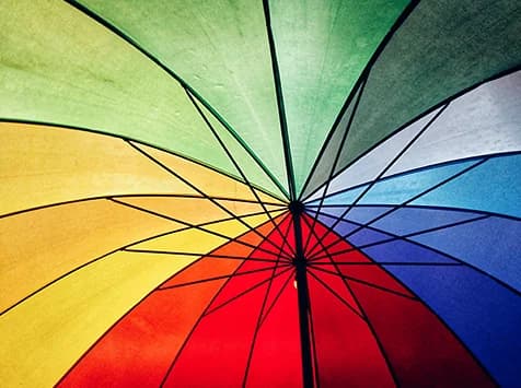
Warm Colors: Energy, Passion, and Action

Warm colors are directly associated with energy. They're considered "warm" because of their red content, ranging from deep burgundy tones through orange to yellow.
These are the colors of fire, love, passion, sunsets, and autumn leaves. They transmit closeness, intimacy, energy, and warmth.
Red: The Attention-Grabber
Red generates adrenaline secretion, increases our pulse, and accelerates breathing. This color evokes many positive and powerful emotions—but also some contradictory ones, ranging from love to fear, from passion to aggression.
What Red Symbolizes:
- Blood, fire, and passion
- Danger, urgency, and attention
- Power, excitement, and energy
Famous Brands Using Red:
- Coca-Cola - Creates excitement and stimulates appetite
- Netflix - Evokes entertainment and passion
- YouTube - Captures attention and encourages engagement
- Target - Stimulates quick purchasing decisions
- CNN - Conveys urgency and importance
Best Use Cases for Red:
- Call-to-action buttons
- Sale and clearance promotions
- Food and beverage brands
- Entertainment companies
- Emergency and healthcare services
Industry Popularity:
- High popularity: Food, technology, vehicles, agriculture
- Medium popularity: Home goods, healthcare
- Low popularity: Energy, finance, travel, fashion
Pro Tip: Use red in moderation—while it effectively captures attention regardless of age or gender, it can fatigue the eyes when overused.
Orange: The Enthusiasm Builder
Orange is a warm, eye-catching color that gives us a feeling of enthusiasm. It provides the passion of red combined with the fun of yellow, making it extremely popular in sports and festivities.
What Orange Symbolizes:
- Light, joy, and friendship
- Adventure and enthusiasm
- Creativity and confidence
- In India, it represents spiritual "illumination" and perfection
Famous Brands Using Orange:
- Amazon (smile) - Friendly and accessible
- Fanta - Fun and energetic
- Harley-Davidson - Adventure and freedom
- Nickelodeon - Playful and youthful
- Home Depot - Energetic and approachable
Best Use Cases for Orange:
- Brands targeting younger audiences
- Sports and fitness companies
- Food brands (stimulates appetite)
- Creative agencies
- E-commerce call-to-actions
Industry Popularity:
- High popularity: Technology, healthcare
- Medium popularity: Food, home goods, agriculture
- Low popularity: Energy, finance, travel, fashion, vehicles
Caution: Orange directly associates with the fruit of the same name, so consider this connection for your brand context.
Yellow: The Optimism Projector
Yellow is the most visible and recognizable of all colors. It creates a great initial impression but can become tiresome or "loud" if overused.
What Yellow Symbolizes:
- Gold, power, and divinity
- Intelligence and hope
- Action and dynamism
- In Islamic religion: wisdom
- In China: historically associated with the emperor
Famous Brands Using Yellow:
- McDonald's (Golden Arches) - Happiness and energy
- IKEA - Optimism and affordability
- Best Buy - Value and excitement
- Snapchat - Youth and spontaneity
- Ferrari - Prestige and energy
Best Use Cases for Yellow:
- Food and restaurant brands
- Children's products
- Energy companies
- Warning and safety signage
- Accent color for CTAs
Industry Popularity:
- High popularity: Energy, food, restaurants
- Medium popularity: Healthcare, agriculture
- Low popularity: Finance, travel, fashion, vehicles, technology
Important Note: Greenish yellows can evoke negative emotions like nausea, while pale yellows may suggest cowardice. Combine yellow with black for high-visibility designs—this contrast is widely used in traffic and warning signs.
Cool Colors: Trust, Calm, and Professionalism

Cool colors are directly associated with tranquility and security. They're considered "cool" because of their blue content, spanning from purple through blue to green tones.
These are the colors of the sky, grass, winter, night, and rainwater. They transmit expansiveness, calm, seriousness, and professionalism.
Blue: The Trust Builder
Blue gives us different but consistently positive sensations. Most often, it makes us feel calm, fresh, and clean, though sometimes it conveys power, grandeur, perfection, and mystery.
Have you ever heard the phrase "blue blood" or "Prince Charming" (often associated with blue in many cultures)? Blue has long been connected with nobility and trustworthiness.
What Blue Symbolizes:
- Depth and source of life (associated with water)
- Vitality, authority, success, and constancy
- Professionalism and reliability
- Technology and innovation
Famous Brands Using Blue:
- Facebook - Trust and connection
- IBM - Reliability and intelligence
- Ford - Dependability and tradition
- Samsung - Innovation and quality
- PayPal - Security and trust
- LinkedIn - Professionalism and networking
Best Use Cases for Blue:
- Financial institutions and banks
- Healthcare and medical companies
- Technology and software firms
- Corporate and B2B brands
- Government agencies
- Cleaning and hygiene products
Industry Popularity:
- High popularity: Energy, finance, airlines, technology, healthcare, agriculture
- Medium popularity: Home goods
- Low popularity: Fashion, food, vehicles
Pro Tip: Dark blue tones are particularly effective for attracting male demographics. While blue promotes tranquility, excessive use can potentially dampen moods.
Purple: The Sophistication Signal
Purple is a sophisticated and mysterious color. It's normally associated with independence, wisdom, dignity, and elegance.
What Purple Symbolizes:
- Royalty, originality, and inspiration
- Creativity and spirituality
- In some cultures: spirituality
- In Thailand: the color of mourning
- Associated with beautiful flowers (violet, lilac, lavender)
Famous Brands Using Purple:
- Cadbury - Luxury and indulgence
- Hallmark - Creativity and sentimentality
- Yahoo - Innovation and uniqueness
- Twitch - Entertainment and creativity
- FedEx - Reliability with a creative edge
Best Use Cases for Purple:
- Creative agencies and studios
- Luxury and premium brands
- Beauty and cosmetics
- Spiritual and wellness products
- Children's brands (perceived as "fun")
- Youth-oriented brands (ages 18-25 view it as "rebellious")
Industry Popularity:
- High popularity: Finance, technology, healthcare
- Medium popularity: Travel, fashion, food, home goods, vehicles
- Low popularity: Energy, agriculture
Caution: Use purple sparingly—excessive amounts can evoke negative emotions in many people.
Green: The Growth Indicator
Green is commonly used for "green" and natural businesses, including organic and vegetarian food companies. It's also popular in financial services.
What Green Symbolizes:
- Nature, growth, and freshness
- Serenity, health, and wellness
- Environmental consciousness
- Money and prosperity
- Calm, security, and trust (similar to blue)
Famous Brands Using Green:
- Starbucks - Natural, relaxing experience
- Whole Foods - Organic and healthy
- Spotify - Fresh and modern
- WhatsApp - Simple and trustworthy
- John Deere - Agriculture and growth
- Animal Planet - Nature and wildlife
Best Use Cases for Green:
- Organic and natural food brands
- Environmental and eco-friendly companies
- Health and wellness brands
- Financial institutions
- Agricultural businesses
- Technology startups
Industry Popularity:
- High popularity: Food, technology, vehicles, agriculture
- Medium popularity: Home goods, healthcare
- Low popularity: Energy, finance, travel, fashion
Color Psychology by Industry Sector
Understanding industry-specific color conventions helps you either align with expectations or strategically differentiate.
Technology Sector:
- Dominant colors: Blue (trust), green (innovation), orange (energy)
- Examples: Facebook (blue), Spotify (green), Amazon (orange accent)
- Trend: Move toward gradients and multi-color logos
Food & Beverage:
- Dominant colors: Red (appetite stimulation), yellow (happiness), green (health)
- Examples: McDonald's, Coca-Cola, Whole Foods
- Key insight: Warm colors stimulate appetite
Financial Services:
- Dominant colors: Blue (trust), green (money), purple (premium)
- Examples: PayPal, American Express, Fidelity
- Key insight: Conservative palettes build confidence
Healthcare:
- Dominant colors: Blue (trust), green (health), white (cleanliness)
- Examples: Pfizer, Johnson & Johnson, CVS
- Key insight: Clean, calming colors reduce anxiety
Luxury & Fashion:
- Dominant colors: Black (sophistication), gold (premium), white (elegance)
- Examples: Chanel, Louis Vuitton, Gucci
- Key insight: Minimalist palettes convey exclusivity
5 Best Practices for Choosing Your Brand Colors
1. Study Your Competition
Don't choose the same colors everyone else uses—standing out from competitors can be a significant advantage. However, understand why certain colors dominate your industry before deviating.
Action Step: Create a color audit of your top 10 competitors. Identify opportunities to differentiate while maintaining industry credibility.
2. Use Pantone Colors Strategically
Remember that colors change depending on where and how you print—except for Pantone colors. Using Pantone references ensures consistency across all materials.
Action Step: Invest in a Pantone guide and specify exact Pantone codes in your brand guidelines.
3. Limit Your Palette to 2-3 Colors
While it may seem fun to choose a logo with many colors, more colors mean less memorability and potential printing problems. Multi-color logos are only recommended for multi-service companies to convey diversity and inclusivity (like Google or NBC).
Recommended Structure:
- Primary color: Your main brand identifier (60% usage)
- Secondary color: Supports and complements primary (30% usage)
- Accent color: For CTAs and highlights (10% usage)
4. Master Color Combinations
If you have a primary color and want a secondary color, consider these proven techniques:
- Complementary colors: Opposite on the color wheel (high contrast)
- Analogous colors: Adjacent on the color wheel (harmonious)
- Triadic colors: Evenly spaced (vibrant and balanced)
Tools: Use Adobe Color, Coolors, or Color Hunt to explore combinations.
5. Consider Your Global Audience
If your brand targets new markets, thoroughly understand their culture to avoid misunderstandings.
Cultural Color Meanings:
- Red in China: Luck, prosperity, and celebration (brides wear red)
- Red in India: Purity and spirituality (but also mourning in some contexts)
- White in Western cultures: Purity and weddings
- White in Eastern cultures: Often associated with death and mourning
- Purple in Thailand: Color of mourning
- Green in Islamic cultures: Sacred and positive
Action Step: Research color meanings in every market you plan to enter.
Common Mistakes to Avoid
Mistake 1: Following Trends Over Strategy
Trendy colors fade—your brand identity shouldn't. Choose colors that align with your brand values, not just what's popular on Instagram this year.
Mistake 2: Ignoring Color Accessibility
Approximately 8% of men and 0.5% of women have color vision deficiency. Ensure your color combinations provide sufficient contrast and don't rely solely on color to convey information.
Quick Test: View your design in grayscale. If important elements disappear, reconsider your palette.
Mistake 3: Inconsistent Color Usage
Using different shades of your brand colors across platforms dilutes brand recognition. Create strict color guidelines with exact hex codes, RGB, CMYK, and Pantone values.
Mistake 4: Choosing Colors You Like Instead of Colors That Work
Your personal favorite color may not resonate with your target audience. Base decisions on psychology and market research, not personal preference.
Mistake 5: Neglecting Digital vs. Print Differences
Colors appear differently on screens (RGB) versus printed materials (CMYK). Always test your colors in both environments before finalizing.
Conclusion
Choosing the right brand colors isn't just about aesthetics—it's a strategic business decision that impacts how customers perceive and connect with your brand.
Key Takeaways:
- Warm colors (red, orange, yellow) create energy, urgency, and appetite stimulation
- Cool colors (blue, purple, green) build trust, convey professionalism, and suggest growth
- Limit your palette to 2-3 colors for maximum impact and memorability
- Consider culture when expanding to international markets
- Test accessibility to ensure inclusivity
- Maintain consistency across all brand touchpoints
Your Next Step: Audit your current brand colors against the psychology principles in this guide. Do they align with your brand values and target audience expectations?
Need Help Creating Your Brand Identity?
At Alkitu, we specialize in creating cohesive visual identities that resonate with your target audience and drive business results. Our team combines strategic thinking with creative execution to build brands that stand out.
Discover our branding services | Contact us for a free consultation
Related Posts
- How Did We Get to Marketing 4.0? The Complete Evolution - Understanding modern brand strategy
- What Is a Web Domain? Essential Guide to Domain Names and Extensions - Building your online presence
Tags: #Branding #LogoDesign #ColorPsychology #VisualIdentity #Design #Marketing
You might also like
Digital vs Physical Advertising: The Ultimate Guide to Transform Your Marketing Strategy
In the age of digitalization, advertising has evolved dramatically. Learn the essential differences between digital and physical advertising, their unique benefits, and how to combine them for maximum marketing impact in your 360-degree campaigns.
10 min
Marketing 4.0: The Ultimate Guide to Understanding Marketing's Complete Evolution
From product-focused strategies to social purpose-driven brands, marketing has undergone a revolutionary transformation. Discover the complete evolution through Philip Kotler's lens and learn how to adapt your business for the digital age.
12 min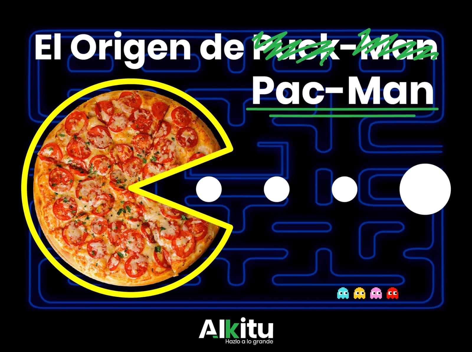
Iconic Pac-Man Design: Essential Lessons from Gaming's Most Memorable Character
How did a pizza break create gaming's most iconic character? Discover the revolutionary design decisions behind Pac-Man and the timeless lessons every designer should know.
9 min